April 30, 2011

rain, rain go away


I wanted to get this card posted while the calendar is still turned to April. This card was actually made and its note written during some torrential downpours. Not surprising since we had about 100 days of rain during the month. And if May’s flowers appear in direct proportion to the number of inches of April rain, we will experience a gloriously colorful month.


When I finished this card, I felt like there was something missing and considered rounding a corner or two. My fear over making it look too bad to use and not having anymore of the rain paper stopped me from taking that step. The next day I listened to Papertrey Radio #6 and the topic of rounding corners was covered. If only I had heard Maile’s suggestions a day earlier, I probably would have rounded one or two of the right-hand corners, but I’m still not sure that would have added to the design. Too bad there isn’t a way to determine that without actually cutting into the card. I guess I just need to become fearless.


I thought I’d share my trick for using the pinked-square die to cut a smaller square for a matted effect. First cut the standard square; then, line it up in the die one row over on the top and right sides. (It’s probably best just to study the above photo. This is definitely one of those times when a picture is worth a thousand words.) Tape the paper in place and run it through your machine. I rarely save scraps since I have limited crafting space, but the extra little corner piece looks like it would add just the right touch on a future project, so I put it aside.


I look forward to seeing those May flowers.

nancy

supplies:
paper:  white c/s (Staples); raspberry fizz c/s (PTI); Noah’s Ark pp (Debbie Mumm)
stamps:  April (Hero Arts)
ink:  rose bud dye (Memento); Cape Cod and silk green pigment (Colorsnap)
dies:  button card collection (PTI)
extras:  raspberry fizz buttons (PTI); snowflake pearls (Queen&Co); white floss (DMC)
April 29, 2011

wmsc44


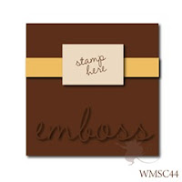
Seeing this week’s Waltzingmouse Stamps Challenge sketch, I knew that I wanted to play along. I had recently purchased the labels 14 stamp set on the PTI forum, and believed it would work well with the sketch along with some of the absolutely gorgeous Watercolor Bouquet patterned paper.


This thank you card is for my parents. They are always so supportive of me, even as my dad battles an increasingly aggressive cancer, that I wanted to send a note expressing my appreciation and love. I think this card is a lovely vehicle for those thoughts.

The patterned paper was embossed with a flourish.


It usually takes me so long to make a card that I will often make a second one. In this case, the second is a birthday card to put into my stash, which is currently low on birthday cards, this being the only one. Creative Buzz, my blogging group, is having our first theme party and this month’s theme is (surprise) birthdays. Please visit Anna’s blog for the post and share your birthday cards.

nancy

supplies:
paper:  rustic white c/s (PTI); Watercolor Bouquet pp (K&Company)
stamps:  Rescue Remedies Additions and Holiday Label No 14 (WMS); Happy Greetings (Hero Arts)
ink:  sweet plum dye (Memento); rouge and pink pastel chalk (Colorsnap)
dies:  Labels Fourteen (Spellbinders)
extras:  Flourish Impressabilities (Spellbinders); lace (LSS); ribbon (Michael’s)

April 24, 2011

easter greetings


For holidays, I usually go into mass production mode. It was no different this Easter, except that I decided to make a little something different for my parents and daughter. For both designs, I turned to Melissa Phillips for inspiration, using some cards she made with the PTI Take Three sets for spring and fall.


The cards are a little smaller in scale, made by cutting a sheet of cardstock in thirds along the 11-inch side. My color palette was dictated by Easter ribbon found at Michael’s. Each of the nine cards was unique in its color mix allowing me to choose a card that would best (or, at least, better) fit the recipient. Here are a few individual shots.


For me, the only problem with mass production is the signing of the cards. I like to write a personal note inside each card, but find I’m usually running out of steam by that time and end up with one great message used for all. Should I believe my spin that it is better to send these cards with the thoughtfully written but non-personalized note than nothing at all? What do you think/do?


The card design used for my parents and daughter has a similar feel as the mass-produced cards, but is a standard 4¼ x 5½” size. With the colors and use of gingham, this yielded a sweet card that put a smile on my face. I hope it produces the same reaction when pulled from the envelope.


This was an unexpectedly happy Easter weekend with my daughter. It wasn’t unexpected that it was happy, although, I am always grateful for that feeling. The surprising part is that Brianna and I had the entire weekend together. The original plan was for me to drive to Vermont and spend part of the day with Brianna. Instead, she drove home Friday afternoon and we went fabric shopping, watched movies, saw a dance performance and celebrated Easter together until late this afternoon when she returned to school. It was a most unexpected gift.


I hope that your Easter was joyous and your weekend filled with surprising blessings.

nancy

supplies:
paper:  white c/s (Staples); green c/s (Recollections); rustic white c/s (PTI); yellow pp (Martha Stewart); baby boy and baby girl pp (Debbie Mumm); gingham pp (A Muse)
stamps:  Happy Easter (Crafty Secrets); Bitty Background Blocks (PTI); Borders (Heidi Grace); Series 29 (Studio G)
ink:  VersaMark; dandelion, rose bud and new sprout dye (Memento); sunflower yellow pigment (Brilliance); robin’s egg and fresh green pigment (Colorsnap)
dies:  button card collection and tiny tags (PTI)
extras:  clear embossing powder (PSX); Swiss Dots embossing folder (Cuttlebug); ribbon and flowers (Michael’s); buttons (PTI); floss #4077 (DMC)

April 13, 2011

happy birthday, brianna


My daughter, Brianna, turns 22 today. Because her first love is dance and she had told me that a tutu had to be involved in a dancer’s 22nd birthday, I knew there would be a tutu on her card. I had already made her an actual tutu card, so I was trying to come up with a different approach when I saw Elena’s card during the last PTI blog hop. What made the idea of using a dress form special is that the stamp I planned to use was actually given to me by Brianna. She had purchased the stamp for herself a few years ago and passed it on to me when I got more involved with this craft.


This was not the first version of Brianna’s card. I was letting the tulle I had on hand, along with not wanting to do a repeat, direct my color choice, which initially was light blue. When looking through my cardstock, I came across a gloriously rich deep purple and decided to change my color direction. The finished card disappointed me with its anemic feel. The purple was barely visible, so its power was diluted until little of it remained.


My dilemma:  Do I send the card to Brianna so that it arrives on time, or do I remake the card and have it arrive a day late? I chose the latter. God was looking out for me that day and I was able to gently pull the majority of card apart and reuse it. And I made it to the post office on time.

Happy 22 birthday, Brianna!

mom, aka nancy

supplies:
paper:  purple shades c/s (Bazzill); red c/s (Recollections)
stamps:  dress form (Inkadinkado); Birthday Bash Sentiments (PTI); Old French Writing (Hero Arts); A Sexy Little Number used inside (Crafty Secrets)
ink:  VersaMark; grape jelly dye (Memento); lavender chalk (Colorsnap)
extras:  tulle (Jo-Ann’s); ribbon, jewelry head pin and beads (Michael’s); crystals (Jolee’s)

April 11, 2011

just a little note


This is literally just a little note… that took me forever to make. I started out with a different approach that just didn’t work with the mat stack 2 stamp that I wanted to use. Rather than change the stamp, I worked with the rest of the card until I was happy with the result.


All of the stamping on the card is embossed, so the challenge of MIM#9, heat embossing, has been met. 


Happy Monday. Hope you have a great week. (And that is my little note to you.)

nancy

supplies:
paper:  white c/s (Staples); red c/s (Recollections)
stamps:  mat stack 2 collection (PTI)
ink:   VersaMark; lady bug dye (Memento)
extras:  black and clear embossing powders (Personal Stamp Exchange)

April 8, 2011

persevere


My daughter, Brianna, is a video arts major. In addition to her films, she also creates art installations. Brianna decided that it would be beneficial to take woodshop this semester. The first project for the class was a mallet and, during its construction, Brianna discovered that she is too small to easily use the equipment. She is 5’2” and has to stand on tiptoe to work the saw, and her hands cannot make it around the tools. Each time she leaves the shop, I get a call from her telling me what a challenge the class is. I hear about her bruises from the saw kickback and drawing blood with a chisel, but she is determined to learn the equipment and techniques and finish her projects.


This card was sent to Brianna to remind her to persevere with her woodworking. I used material symbolic of a woodshop and Brianna’s latest project. (She has completed her mallet.) There are wood grain alphas, burlap, corrugated cardboard and cork for the woodshop side. The pink and blue items represent Brianna’s latest project, fairy furniture.


I found a great quote by Thomas Foxwell Buxton on perseverance that I included inside the card:  With ordinary talent and extraordinary perseverance, all things are attainable.

nancy

supplies:
paper:  kraft c/s (PTI); tutu dot (BoBunny); Let It Snow! collection (K&Company); corrugated cardboard (PTI packaging)
stamps:  Tim Holtz Paisley Prints (Stamper’s Anonymous)
paint:  Snow White acrylic paint (DecoArt)
dies:  Labels 14 (Spellbinders)
extras:  burlap (Jo-Ann’s); cork (Quartet); woodgrain alpha (K&Company); baby pink candy dots (Pebbles Inc.); floss #4180 and 4230 (DMC)

April 6, 2011

showers of …


Last Sunday was my niece Amy’s bridal shower. It was a lovely afternoon. Since gifts are the focus of a shower, I just have to say that some of the ladies outdid themselves on their wrapping. There were bath towels rolled and stacked as a wedding cake, complete with ribbon woven with flowers, pearls and wedding rings. Another package had fresh roses adorning it. And my favorite was three large stacked boxes draped in white tulle, which was gathered at the top with lilac type flowers flowing down the sides. Sorry there are no pictures to share, but my photos didn’t turn out.

The card befuddled me a bit for it’s been some time since I’ve needed one for a bridal shower. Besides the colors taken from the invitation, the only thing I was sure of using was the little Martha Stewart umbrella punch I had bought on clearance for $2.99 last summer. (Thus far, it has been a waste of money since I haven’t used it.) After playing with some different sketches on paper and then the actual elements, here’s the final card.


The occasional downside of my cards is that there is a lot of space inside for a message, which is a bad thing when you are running late and not sure what to write. For those of you in the same position, feel free to use my words:  Best wishes for a wedding as magical as your dreams and a marriage better than you ever imagined. May all the love you and Tim have come to know continue to grow.


nancy

supplies:
paper:  white c/s (Staples); yellow and pink c/s (Recollections); Bianca (Melissa Frances); Pink Thin Stripes (Frances Meyer)
stamps:  Simple Valentine and Tiny Tags (PTI)
ink:  razzberry (Colorsnap); pink geranium pigment (Martha Stewart)
punches:  umbrella and doily lace edge (Martha Stewart)
extras:  pink mini foil alphas (Jolee’s); flowers (Michael’s); floss #4180 (DMC); coarse glitter (Martha Stewart); yellow marker from stash

April 3, 2011

it’s a beautiful thing


Last weekend, Laurie wrote about the time she used to spend in the card aisle and shared a card she made based on inspiration from a recent visit to said aisle. Many of the card makers that read Laurie’s blog related to her words. In fact, there were so many people commenting that Laurie put out a challenge to her readers to go and find some card inspiration and whip something up.

I too used to spend hours looking at cards. I would park myself at Hallmark or the now defunct Treasure Island (how I miss that store) or PAPYRUS searching for THE perfect card. So this week, while at Target, I took a detour through the card section to see if I could find a little inspiration for the challenge. Being totally honest, I have to tell you that I started out looking at not-so-fine cards so that mine would look better than the original. My eyes and hands were too well trained, though, and kept going to the PAPYRUS cards. Here’s the one that I chose for my inspiration:


You cannot tell from the photograph, but this card is wonderful in person. (I had to photograph the card through its cellophane package, and Target’s lighting is not conducive to furtive shots.) The card is white textured cardstock with a light blue border. There is a blue thread weaving its way through blue vellum flowers with blue seed pearl centers. The card has both a charm and elegance to it. If the card didn’t cost $5.95, I might have been tempted to buy it. Of course, I would have blamed Laurie for that purchase. We all know, I wouldn’t have been in that aisle in the first place if it weren’t for Laurie’s challenge.


My take on the PAPYRUS card is in pink since I don’t have blue vellum. I made a few modifications, but the card is fairly close to the original. My card is sweet and I like it, but I would rather it be charming and elegant. Perhaps, I need to try it again in blue.

The beauty of this sweet little card is that it didn’t cost me $5.95. All of the materials were already in my supplies, so nothing was spent. (Does that mean it cost nothing?) And because I used a stamp set and two punches, their per use costs decreased. Ah, rationalization is a beautiful thing.

nancy

supplies:
paper:  white c/s (Staples); passion fruit vellum (WorldWin)
stamps:  Thank You Sayings (Hero Arts)
ink:  silver pigment (Clearsnap)
punches:  traditional scallop edge (Martha Stewart); flower power (EK Success)
extras:  white mini pearls (Martha Stewart); floss #4180 (DMC)