May 29, 2011

love today and always


Amy, my brother’s daughter, was married two weeks ago. The photo of Tom and Amy walking up the aisle during the wedding was too blurred to share, so I thought I’d share their entrance from the rehearsal. I gave my camera to Brianna to take pictures during the ceremony because I was doing a reading and didn’t want my shaking (nerves!) to interfere with the photos. She told me when she returned my camera that it was probably a mistake to give a camera to a film major. You’ll understand what she meant when you see a few of her photos.


Although blurred, I love this shot of Mary Ellen and Amy. This was taken during the lighting of the candles by the mothers of the bride and groom.

 Brianna was intrigued with the details of Katie’s hair.


The card has a traditional cream and white color scheme because I cannot do anything else for a wedding card. I did take Amy and Tim’s style into account for the remaining design of the card though. The sentiment is computer generated; the type and color of the font came from the wedding invitations.


I was honored that Amy and Tim asked me to be a lector for their ceremony and I was overjoyed that my reading was 1 Corinthians 13:1-8. Its words are a poignant reminder to all of the wonder of love in all types of relationships.

“Love never fails.”


nancy

PS – I just realized that I didn’t post a photograph of Tim (Can you tell I’m from the bride’s side?), so here’s one of Amy and Tim's engagement photos.

 
supplies:
paper:  French vanilla and avalanche c/s (Bazzill)
punches:  heart (Marvy Uchida)
extras:  doily (Royal Crafts); pearl flourish (Recollections); Old Script font

May 8, 2011

happy mother’s day


Motherhood:  All love begins and ends there.
~ Robert Browning

It’s just another day here with my daughter in Vermont and my mom in Virginia. How pathetic that sounds; but know that I thank God every day for letting me be a mom to Brianna, and I adore my mother and have her in my heart always. So this truly is just another day. Granted, I wish that I were spending it in their company with a piece of lemon meringue pie and a game of cards. We’ve spent a lot of memorable time together over games of some sort.


My mom’s favorite color is blue, so I try to use that color in cards I make just for her. She also likes things in pairs, which had a play in this design as well. I fought with that third brad, but it insisted that little bit of extra color was needed at the top of the card. The brad was right.

I hope that your Mother’s Day is a wonderful celebration of love.

nancy

supplies:
paper:  rustic white and rustic cream c/s (PTI); Watercolor Bouquet (K&Company)
stamps:  Simple Valentine (PTI)
ink:  bamboo leaves dye (Memento); Cape Cod pigment (Colorsnap)
dies and punches:  button card collection die (PTI); traditional scallop edger (Martha Stewart) for inside
extras:  colored pencils (Crayola); ribbon and flowers (Michael’s); pearl brads (American Crafts); ecru and 4065 floss (DMC); alpha stickers (Jolee’s); buttons (PTI and LaMode)

April 30, 2011

rain, rain go away


I wanted to get this card posted while the calendar is still turned to April. This card was actually made and its note written during some torrential downpours. Not surprising since we had about 100 days of rain during the month. And if May’s flowers appear in direct proportion to the number of inches of April rain, we will experience a gloriously colorful month.


When I finished this card, I felt like there was something missing and considered rounding a corner or two. My fear over making it look too bad to use and not having anymore of the rain paper stopped me from taking that step. The next day I listened to Papertrey Radio #6 and the topic of rounding corners was covered. If only I had heard Maile’s suggestions a day earlier, I probably would have rounded one or two of the right-hand corners, but I’m still not sure that would have added to the design. Too bad there isn’t a way to determine that without actually cutting into the card. I guess I just need to become fearless.


I thought I’d share my trick for using the pinked-square die to cut a smaller square for a matted effect. First cut the standard square; then, line it up in the die one row over on the top and right sides. (It’s probably best just to study the above photo. This is definitely one of those times when a picture is worth a thousand words.) Tape the paper in place and run it through your machine. I rarely save scraps since I have limited crafting space, but the extra little corner piece looks like it would add just the right touch on a future project, so I put it aside.


I look forward to seeing those May flowers.

nancy

supplies:
paper:  white c/s (Staples); raspberry fizz c/s (PTI); Noah’s Ark pp (Debbie Mumm)
stamps:  April (Hero Arts)
ink:  rose bud dye (Memento); Cape Cod and silk green pigment (Colorsnap)
dies:  button card collection (PTI)
extras:  raspberry fizz buttons (PTI); snowflake pearls (Queen&Co); white floss (DMC)

April 29, 2011

wmsc44


Seeing this week’s Waltzingmouse Stamps Challenge sketch, I knew that I wanted to play along. I had recently purchased the labels 14 stamp set on the PTI forum, and believed it would work well with the sketch along with some of the absolutely gorgeous Watercolor Bouquet patterned paper.


This thank you card is for my parents. They are always so supportive of me, even as my dad battles an increasingly aggressive cancer, that I wanted to send a note expressing my appreciation and love. I think this card is a lovely vehicle for those thoughts.

The patterned paper was embossed with a flourish.


It usually takes me so long to make a card that I will often make a second one. In this case, the second is a birthday card to put into my stash, which is currently low on birthday cards, this being the only one. Creative Buzz, my blogging group, is having our first theme party and this month’s theme is (surprise) birthdays. Please visit Anna’s blog for the post and share your birthday cards.

nancy

supplies:
paper:  rustic white c/s (PTI); Watercolor Bouquet pp (K&Company)
stamps:  Rescue Remedies Additions and Holiday Label No 14 (WMS); Happy Greetings (Hero Arts)
ink:  sweet plum dye (Memento); rouge and pink pastel chalk (Colorsnap)
dies:  Labels Fourteen (Spellbinders)
extras:  Flourish Impressabilities (Spellbinders); lace (LSS); ribbon (Michael’s)

April 24, 2011

easter greetings


For holidays, I usually go into mass production mode. It was no different this Easter, except that I decided to make a little something different for my parents and daughter. For both designs, I turned to Melissa Phillips for inspiration, using some cards she made with the PTI Take Three sets for spring and fall.


The cards are a little smaller in scale, made by cutting a sheet of cardstock in thirds along the 11-inch side. My color palette was dictated by Easter ribbon found at Michael’s. Each of the nine cards was unique in its color mix allowing me to choose a card that would best (or, at least, better) fit the recipient. Here are a few individual shots.


For me, the only problem with mass production is the signing of the cards. I like to write a personal note inside each card, but find I’m usually running out of steam by that time and end up with one great message used for all. Should I believe my spin that it is better to send these cards with the thoughtfully written but non-personalized note than nothing at all? What do you think/do?


The card design used for my parents and daughter has a similar feel as the mass-produced cards, but is a standard 4¼ x 5½” size. With the colors and use of gingham, this yielded a sweet card that put a smile on my face. I hope it produces the same reaction when pulled from the envelope.


This was an unexpectedly happy Easter weekend with my daughter. It wasn’t unexpected that it was happy, although, I am always grateful for that feeling. The surprising part is that Brianna and I had the entire weekend together. The original plan was for me to drive to Vermont and spend part of the day with Brianna. Instead, she drove home Friday afternoon and we went fabric shopping, watched movies, saw a dance performance and celebrated Easter together until late this afternoon when she returned to school. It was a most unexpected gift.


I hope that your Easter was joyous and your weekend filled with surprising blessings.

nancy

supplies:
paper:  white c/s (Staples); green c/s (Recollections); rustic white c/s (PTI); yellow pp (Martha Stewart); baby boy and baby girl pp (Debbie Mumm); gingham pp (A Muse)
stamps:  Happy Easter (Crafty Secrets); Bitty Background Blocks (PTI); Borders (Heidi Grace); Series 29 (Studio G)
ink:  VersaMark; dandelion, rose bud and new sprout dye (Memento); sunflower yellow pigment (Brilliance); robin’s egg and fresh green pigment (Colorsnap)
dies:  button card collection and tiny tags (PTI)
extras:  clear embossing powder (PSX); Swiss Dots embossing folder (Cuttlebug); ribbon and flowers (Michael’s); buttons (PTI); floss #4077 (DMC)

April 13, 2011

happy birthday, brianna


My daughter, Brianna, turns 22 today. Because her first love is dance and she had told me that a tutu had to be involved in a dancer’s 22nd birthday, I knew there would be a tutu on her card. I had already made her an actual tutu card, so I was trying to come up with a different approach when I saw Elena’s card during the last PTI blog hop. What made the idea of using a dress form special is that the stamp I planned to use was actually given to me by Brianna. She had purchased the stamp for herself a few years ago and passed it on to me when I got more involved with this craft.


This was not the first version of Brianna’s card. I was letting the tulle I had on hand, along with not wanting to do a repeat, direct my color choice, which initially was light blue. When looking through my cardstock, I came across a gloriously rich deep purple and decided to change my color direction. The finished card disappointed me with its anemic feel. The purple was barely visible, so its power was diluted until little of it remained.


My dilemma:  Do I send the card to Brianna so that it arrives on time, or do I remake the card and have it arrive a day late? I chose the latter. God was looking out for me that day and I was able to gently pull the majority of card apart and reuse it. And I made it to the post office on time.

Happy 22 birthday, Brianna!

mom, aka nancy

supplies:
paper:  purple shades c/s (Bazzill); red c/s (Recollections)
stamps:  dress form (Inkadinkado); Birthday Bash Sentiments (PTI); Old French Writing (Hero Arts); A Sexy Little Number used inside (Crafty Secrets)
ink:  VersaMark; grape jelly dye (Memento); lavender chalk (Colorsnap)
extras:  tulle (Jo-Ann’s); ribbon, jewelry head pin and beads (Michael’s); crystals (Jolee’s)

April 11, 2011

just a little note


This is literally just a little note… that took me forever to make. I started out with a different approach that just didn’t work with the mat stack 2 stamp that I wanted to use. Rather than change the stamp, I worked with the rest of the card until I was happy with the result.


All of the stamping on the card is embossed, so the challenge of MIM#9, heat embossing, has been met. 


Happy Monday. Hope you have a great week. (And that is my little note to you.)

nancy

supplies:
paper:  white c/s (Staples); red c/s (Recollections)
stamps:  mat stack 2 collection (PTI)
ink:   VersaMark; lady bug dye (Memento)
extras:  black and clear embossing powders (Personal Stamp Exchange)

April 8, 2011

persevere


My daughter, Brianna, is a video arts major. In addition to her films, she also creates art installations. Brianna decided that it would be beneficial to take woodshop this semester. The first project for the class was a mallet and, during its construction, Brianna discovered that she is too small to easily use the equipment. She is 5’2” and has to stand on tiptoe to work the saw, and her hands cannot make it around the tools. Each time she leaves the shop, I get a call from her telling me what a challenge the class is. I hear about her bruises from the saw kickback and drawing blood with a chisel, but she is determined to learn the equipment and techniques and finish her projects.


This card was sent to Brianna to remind her to persevere with her woodworking. I used material symbolic of a woodshop and Brianna’s latest project. (She has completed her mallet.) There are wood grain alphas, burlap, corrugated cardboard and cork for the woodshop side. The pink and blue items represent Brianna’s latest project, fairy furniture.


I found a great quote by Thomas Foxwell Buxton on perseverance that I included inside the card:  With ordinary talent and extraordinary perseverance, all things are attainable.

nancy

supplies:
paper:  kraft c/s (PTI); tutu dot (BoBunny); Let It Snow! collection (K&Company); corrugated cardboard (PTI packaging)
stamps:  Tim Holtz Paisley Prints (Stamper’s Anonymous)
paint:  Snow White acrylic paint (DecoArt)
dies:  Labels 14 (Spellbinders)
extras:  burlap (Jo-Ann’s); cork (Quartet); woodgrain alpha (K&Company); baby pink candy dots (Pebbles Inc.); floss #4180 and 4230 (DMC)

April 6, 2011

showers of …


Last Sunday was my niece Amy’s bridal shower. It was a lovely afternoon. Since gifts are the focus of a shower, I just have to say that some of the ladies outdid themselves on their wrapping. There were bath towels rolled and stacked as a wedding cake, complete with ribbon woven with flowers, pearls and wedding rings. Another package had fresh roses adorning it. And my favorite was three large stacked boxes draped in white tulle, which was gathered at the top with lilac type flowers flowing down the sides. Sorry there are no pictures to share, but my photos didn’t turn out.

The card befuddled me a bit for it’s been some time since I’ve needed one for a bridal shower. Besides the colors taken from the invitation, the only thing I was sure of using was the little Martha Stewart umbrella punch I had bought on clearance for $2.99 last summer. (Thus far, it has been a waste of money since I haven’t used it.) After playing with some different sketches on paper and then the actual elements, here’s the final card.


The occasional downside of my cards is that there is a lot of space inside for a message, which is a bad thing when you are running late and not sure what to write. For those of you in the same position, feel free to use my words:  Best wishes for a wedding as magical as your dreams and a marriage better than you ever imagined. May all the love you and Tim have come to know continue to grow.


nancy

supplies:
paper:  white c/s (Staples); yellow and pink c/s (Recollections); Bianca (Melissa Frances); Pink Thin Stripes (Frances Meyer)
stamps:  Simple Valentine and Tiny Tags (PTI)
ink:  razzberry (Colorsnap); pink geranium pigment (Martha Stewart)
punches:  umbrella and doily lace edge (Martha Stewart)
extras:  pink mini foil alphas (Jolee’s); flowers (Michael’s); floss #4180 (DMC); coarse glitter (Martha Stewart); yellow marker from stash

April 3, 2011

it’s a beautiful thing


Last weekend, Laurie wrote about the time she used to spend in the card aisle and shared a card she made based on inspiration from a recent visit to said aisle. Many of the card makers that read Laurie’s blog related to her words. In fact, there were so many people commenting that Laurie put out a challenge to her readers to go and find some card inspiration and whip something up.

I too used to spend hours looking at cards. I would park myself at Hallmark or the now defunct Treasure Island (how I miss that store) or PAPYRUS searching for THE perfect card. So this week, while at Target, I took a detour through the card section to see if I could find a little inspiration for the challenge. Being totally honest, I have to tell you that I started out looking at not-so-fine cards so that mine would look better than the original. My eyes and hands were too well trained, though, and kept going to the PAPYRUS cards. Here’s the one that I chose for my inspiration:


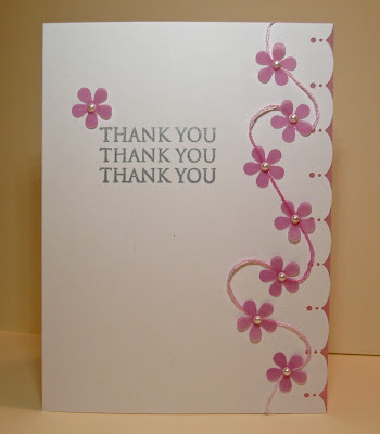
You cannot tell from the photograph, but this card is wonderful in person. (I had to photograph the card through its cellophane package, and Target’s lighting is not conducive to furtive shots.) The card is white textured cardstock with a light blue border. There is a blue thread weaving its way through blue vellum flowers with blue seed pearl centers. The card has both a charm and elegance to it. If the card didn’t cost $5.95, I might have been tempted to buy it. Of course, I would have blamed Laurie for that purchase. We all know, I wouldn’t have been in that aisle in the first place if it weren’t for Laurie’s challenge.


My take on the PAPYRUS card is in pink since I don’t have blue vellum. I made a few modifications, but the card is fairly close to the original. My card is sweet and I like it, but I would rather it be charming and elegant. Perhaps, I need to try it again in blue.

The beauty of this sweet little card is that it didn’t cost me $5.95. All of the materials were already in my supplies, so nothing was spent. (Does that mean it cost nothing?) And because I used a stamp set and two punches, their per use costs decreased. Ah, rationalization is a beautiful thing.

nancy

supplies:
paper:  white c/s (Staples); passion fruit vellum (WorldWin)
stamps:  Thank You Sayings (Hero Arts)
ink:  silver pigment (Clearsnap)
punches:  traditional scallop edge (Martha Stewart); flower power (EK Success)
extras:  white mini pearls (Martha Stewart); floss #4180 (DMC)

March 31, 2011

play ball


There are only two seasons –
winter and baseball.
~ Bill Veeck

The seasons change today with opening day of Major League Baseball, a red-letter day for me, a Yankees fan. I thought it would be fun to send a card celebrating the day to three members of my family who are also baseball fans. Each roots for a different team, so I brought the team colors into the design in a small way.

Indians’ colors for my dad

Mets’ colors for my nephew Eric

Yankees’ colors for my BIL Michael

As I was making these cards, I was reminded of the last episode of Chopped All-Stars when the judges were critiquing the chefs’ dishes. A comment was made that each of the dishes had something wrong with it. That’s how I felt about my cards. The good thing is that it won’t matter to Dad, Eric and Michael. They will be happy at getting a personal, non-birthday card from me out of the blue and won’t care about the crooked stripes.

Go Yankees!

nancy

PS – I’m embarrassed to admit that I’m putting this in for Make It Monday #8, but hey, a free PTI stamp set is up for grabs people. After seeing the wonderful scenes people created with their ink, my card is a bit of a travesty in terms of the MIM#8 category. I read the challenge requirements several times and my card meets them both; it uses PTI product and has ink applied using a tool other than a stamp. You should check out the other entries here.

supplies:
paper:  kraft and rustic cream c/s (PTI)
stamps:  Postmarks (PTI)
ink:  Danube blue, tangelo, Paris dusk, lady bug dye (Memento); frost white pigment and creamy brown chalk (Clearsnap)
extras:  tiny type alpha (Cosmo Cricket); gold metal stickers (Mark Richards); vintage baseball player from The Graphics Fairy; vintage baseball bats from Google image

March 28, 2011

art and the city


There’s a challenge at Moxie Fab World – cityscapes are on the rise – that ends tonight. When I first read about the challenge, I thought of a minibook/card that my daughter made for “a friend” (wink) for Christmas. Brianna pieced a series of cityscape stamped images on to dark blue snowflake paper. The city in snow scene was striking – sorry, no pictures to share – and I told her that I planned on borrowing the idea one day. This challenge would have been the perfect time to incorporate that design, but I couldn’t find a scrap of the paper she used. (I think Brianna hid it, so that her project would be unique.) It was time to come up with another idea.

Bits and pieces of ideas floated about. The stamp was sure to be cityscape by A Muse. I fell in love with the image when I first saw it used on this card by Courtney Kelley. I thought that Glimmer Mist or some such spray could add interest, particularly after seeing it used by MandyKay Starner on this project, but still was having trouble coming up with what would make my card a bit different. During some brainstorming, graffiti came to mind as a type of art that could make up the buildings. Then the sentiment was eluding me. Would you be surprised if I told you that everything I tried was too wordy? So, Google came to my rescue when I searched for city and art quotes. “Nothing else exists when art does” is from an episode of Sex and the City. Here’s the realization of all of those bits and pieces.


Since I had never worked with Smooch Spritz before, I practiced a bit, trying to get the effect I wanted. Even with practice, I am not in love with my background. It’s too evenly covered for the grungy look I wanted, but decided to leave it as is rather than risk ruining it. I told myself that it gave a feeling of nothingness around the buildings that worked with the quote. I thought it would be fun to share a couple of my practice sheets. (Blogger wouldn't let me place all of the pictures where I wanted, so they are limited to two.) I’m going to tuck all of them aside for that day when I start art journaling.

This is my favorite of all, a simple B&W design.


Seeing how colored buildings looked against the black.

Back in January, I made a card that was “a little bit country” and said that I would try to channel my inner rocker. This card is it, since this is as close to rock as I get.

nancy

supplies:
paper:  avalanche c/s (Bazzill); white c/s for the buildings (Staples)
stamps:  cityscape (A Muse)
ink:  tuxedo black dye (Memento)
extras:  black velvet Smooch Spritz (Clearsnap); graffiti from online image; quote from SATC; Sharpies fine line pen

March 27, 2011

bright side


Those lime polka dot cupcake liners brought to mind a sentiment stamp I own that says to look on the bright side. First I thought of going the cupcake route because I am such a literal person, then thought of the flower that I’ve been using frequently of late. It has a polka dot center and the shape reminds me of a flattened cupcake liner. With the elements I was planning to use, I knew the card needed to be clean and graphic, no inked or distressed edges in sight.


The sentiment stamp is rubber, wood-mounted, so I finally needed to break down and use the stamp-a-ma-jig that I bought many months ago.  I now understand why people become converts once they try it.

nancy

supplies:
paper:  gingham (A Muse); white c/s (Staples)
stamps: Look on the bright side (Rubber Soul); Round & Round (PTI); Create Spring (Hampton Art)
ink:  moss green pigment (Clearsnap); tangelo and dandelion dye (Memento)
extras:  ribbon (Michael’s)

March 26, 2011

lemonade


Through the circuitous routes one takes while online, I came across a new challenge blog called hello cutie challenges. Although I think it would be cool some time in the future to say that I started participating with the first challenge, I probably would have skipped this inaugural challenge if not for the colors, particularly that incredible chartreuse.


Why was chartreuse the deal breaking color? Let me tell you a story. Brianna bought this funky little cardigan from J.Crew. Well, actually, she didn’t buy it; her dad did. Anyway, as I was writing… When she grew bored with it, Brianna passed the sweater on to me. I loved that sweater with its color so different from the usual shades I wear. This winter, when I pulled that sweater out of my closet, I noticed some holes in places where there shouldn’t be holes. (I had seen something similar on another sweater, but it was one little hole in an inconspicuous location. I just figured that I had caught the sweater on something.) I called Brianna right away and asked her if she had worn my chartreuse sweater. When she answered in the negative, I told her what I had discovered. It turned out the same thing had happened to a couple of her sweaters. Ye gads, our sweaters were being attacked by moths! Not since back in the day when my mom packed our winter clothes in those smelly mothballs have I had to think about this. Well, actually, I didn’t want to think about it, so I folded the sweater and put it neatly back into my closet. Then, last Sunday night as I was gathering trash and had room to spare in the bag, I decided it was time to toss the sweater. Because the buttons had great character, I cut them off to use on a future project, as any crafter would.


While removing the buttons, I was mentally sorting through my stash, trying to think of what would work with the color/feel of them. With that sweater in hand, I was bemoaning the fact that I wasn’t clever enough to do something with it. Then – Eureka! – fabric flowers came to mind, something I never thought I would use due to the patience and nimble fingers required to make them. I wasn’t sure how the material would stand up to that type of treatment, but decided I had nothing (more) to lose by trying it. So I cut strips of the material and tucked them into a bag for use on a future project.

Oops, too much glue.

Who knew the future would arrive the next day? (Well, we all did/do, but I needed a segue into the next part of my story.) That was the day my circuitous route landed me at hello cutie challenges with its opportune color palette. I decided it was time to once again follow the famous saying:  When life gives you lemons, make lemonade.  So I took some remains from that fabulous chartreuse sweater and made a card.


Now I’m pondering the question: Is this the most expensive card I’ll ever make when I take into account the cost of a J.Crew sweater or is that cost nonexistent since the sweater was headed for the trash? Hmmm.

nancy

supplies:
paper:  kraft c/s (PTI); Farm Fresh (October Afternoon); Quite Contrary (My Mind’s Eye); Lemonade (Basic Grey)
stamps:  Tiny Tags (PTI)
ink:  olive pigment (Clearsnap); rose bud dye (Memento)
dies:  Tiny Tags and Victorian Lace Border (PTI); standard circles large (Spellbinders)
extras:  button and fabric for flowers (J.Crew); coarse glitter (Martha Stewart); pink sorbet twine (The Twinery); ribbon (Michael’s and Jo-Ann’s)

March 25, 2011

cr84fn20: just wanted to say


Usually, the cards I’ve seen created from Hero Art’s Silhouette Grass and PTI’s Life sets have spoken to me. The projects tend to have a very welcoming feel to them. When I saw the challenge colors for CR84FN20, the silhouette cards made with those sets came to mind. Since I do not own either, I looked through what I do own to see if anything would work. Four sets of testing later, I came upon a stamp from a fall set that was a good substitute.


My mom has been sending out a large number of thank you cards lately and I’ve been trying to make some for her stash. So, in addition to the color parameters, the card needed to be fairly simple and require no extra postage to mail. I think it will meet with her approval.

nancy

supplies:
paper:  vintage cream c/s (PTI); Nana’s Nursery (DCWV)
stamps:  Autumn Harvest (TPC Studio); Thank You Sayings (Hero Arts)
ink:  wisteria and lavender chalk (Clearsnap)
extras:  tanzanite crystals (Jolee’s)

papertrey march blog hop challenge


Should you choose to accept, here’s the challenge PTI has issued this month:  Use embroidery floss, but it must be in a fun and inventive way. This could include stitching, wrapping it around and tying it like ribbon, braiding, accenting tags, embroidered patterns or anything else you can dream up! (Thanks, Nichole. You just gave away all my ideas!)

Because there are hundreds of cards to view, I’ll not detain with you with my witty repartee. Here, instead, are my cards. I call them variations on a theme, a play on the DMC Color Variations floss that I used. (Sorry, I couldn’t not write anything!)


Click here to see many amazing creations using embroidery floss.

nancy

supplies:
paper:  Tutu Pink, Fussy, Chablis, Passionate, Piglet and other nameless colors of c/s (Bazzill)
stamps:  Fillable Frames #1 and #5, Just the Ticket (PTI)
ink:  rose bud dye (Memento); midnight and pheasant gold pigment (Colorsnap); VersaMark (Tsukineko)
dies:  standard circles large (Spellbinders)
extras:  Swiss Dots embossing folder (Cuttlebug); Color Variations floss #4190, 4180, 4065 and 4220 (DMC); buttons (PTI and Basic Grey); bridal embossing powder (Personal Stamp Exchange)