March 31, 2011

play ball


There are only two seasons –
winter and baseball.
~ Bill Veeck

The seasons change today with opening day of Major League Baseball, a red-letter day for me, a Yankees fan. I thought it would be fun to send a card celebrating the day to three members of my family who are also baseball fans. Each roots for a different team, so I brought the team colors into the design in a small way.

Indians’ colors for my dad

Mets’ colors for my nephew Eric

Yankees’ colors for my BIL Michael

As I was making these cards, I was reminded of the last episode of Chopped All-Stars when the judges were critiquing the chefs’ dishes. A comment was made that each of the dishes had something wrong with it. That’s how I felt about my cards. The good thing is that it won’t matter to Dad, Eric and Michael. They will be happy at getting a personal, non-birthday card from me out of the blue and won’t care about the crooked stripes.

Go Yankees!

nancy

PS – I’m embarrassed to admit that I’m putting this in for Make It Monday #8, but hey, a free PTI stamp set is up for grabs people. After seeing the wonderful scenes people created with their ink, my card is a bit of a travesty in terms of the MIM#8 category. I read the challenge requirements several times and my card meets them both; it uses PTI product and has ink applied using a tool other than a stamp. You should check out the other entries here.

supplies:
paper:  kraft and rustic cream c/s (PTI)
stamps:  Postmarks (PTI)
ink:  Danube blue, tangelo, Paris dusk, lady bug dye (Memento); frost white pigment and creamy brown chalk (Clearsnap)
extras:  tiny type alpha (Cosmo Cricket); gold metal stickers (Mark Richards); vintage baseball player from The Graphics Fairy; vintage baseball bats from Google image

March 28, 2011

art and the city


There’s a challenge at Moxie Fab World – cityscapes are on the rise – that ends tonight. When I first read about the challenge, I thought of a minibook/card that my daughter made for “a friend” (wink) for Christmas. Brianna pieced a series of cityscape stamped images on to dark blue snowflake paper. The city in snow scene was striking – sorry, no pictures to share – and I told her that I planned on borrowing the idea one day. This challenge would have been the perfect time to incorporate that design, but I couldn’t find a scrap of the paper she used. (I think Brianna hid it, so that her project would be unique.) It was time to come up with another idea.

Bits and pieces of ideas floated about. The stamp was sure to be cityscape by A Muse. I fell in love with the image when I first saw it used on this card by Courtney Kelley. I thought that Glimmer Mist or some such spray could add interest, particularly after seeing it used by MandyKay Starner on this project, but still was having trouble coming up with what would make my card a bit different. During some brainstorming, graffiti came to mind as a type of art that could make up the buildings. Then the sentiment was eluding me. Would you be surprised if I told you that everything I tried was too wordy? So, Google came to my rescue when I searched for city and art quotes. “Nothing else exists when art does” is from an episode of Sex and the City. Here’s the realization of all of those bits and pieces.


Since I had never worked with Smooch Spritz before, I practiced a bit, trying to get the effect I wanted. Even with practice, I am not in love with my background. It’s too evenly covered for the grungy look I wanted, but decided to leave it as is rather than risk ruining it. I told myself that it gave a feeling of nothingness around the buildings that worked with the quote. I thought it would be fun to share a couple of my practice sheets. (Blogger wouldn't let me place all of the pictures where I wanted, so they are limited to two.) I’m going to tuck all of them aside for that day when I start art journaling.

This is my favorite of all, a simple B&W design.


Seeing how colored buildings looked against the black.

Back in January, I made a card that was “a little bit country” and said that I would try to channel my inner rocker. This card is it, since this is as close to rock as I get.

nancy

supplies:
paper:  avalanche c/s (Bazzill); white c/s for the buildings (Staples)
stamps:  cityscape (A Muse)
ink:  tuxedo black dye (Memento)
extras:  black velvet Smooch Spritz (Clearsnap); graffiti from online image; quote from SATC; Sharpies fine line pen

March 27, 2011

bright side


Those lime polka dot cupcake liners brought to mind a sentiment stamp I own that says to look on the bright side. First I thought of going the cupcake route because I am such a literal person, then thought of the flower that I’ve been using frequently of late. It has a polka dot center and the shape reminds me of a flattened cupcake liner. With the elements I was planning to use, I knew the card needed to be clean and graphic, no inked or distressed edges in sight.


The sentiment stamp is rubber, wood-mounted, so I finally needed to break down and use the stamp-a-ma-jig that I bought many months ago.  I now understand why people become converts once they try it.

nancy

supplies:
paper:  gingham (A Muse); white c/s (Staples)
stamps: Look on the bright side (Rubber Soul); Round & Round (PTI); Create Spring (Hampton Art)
ink:  moss green pigment (Clearsnap); tangelo and dandelion dye (Memento)
extras:  ribbon (Michael’s)

March 26, 2011

lemonade


Through the circuitous routes one takes while online, I came across a new challenge blog called hello cutie challenges. Although I think it would be cool some time in the future to say that I started participating with the first challenge, I probably would have skipped this inaugural challenge if not for the colors, particularly that incredible chartreuse.


Why was chartreuse the deal breaking color? Let me tell you a story. Brianna bought this funky little cardigan from J.Crew. Well, actually, she didn’t buy it; her dad did. Anyway, as I was writing… When she grew bored with it, Brianna passed the sweater on to me. I loved that sweater with its color so different from the usual shades I wear. This winter, when I pulled that sweater out of my closet, I noticed some holes in places where there shouldn’t be holes. (I had seen something similar on another sweater, but it was one little hole in an inconspicuous location. I just figured that I had caught the sweater on something.) I called Brianna right away and asked her if she had worn my chartreuse sweater. When she answered in the negative, I told her what I had discovered. It turned out the same thing had happened to a couple of her sweaters. Ye gads, our sweaters were being attacked by moths! Not since back in the day when my mom packed our winter clothes in those smelly mothballs have I had to think about this. Well, actually, I didn’t want to think about it, so I folded the sweater and put it neatly back into my closet. Then, last Sunday night as I was gathering trash and had room to spare in the bag, I decided it was time to toss the sweater. Because the buttons had great character, I cut them off to use on a future project, as any crafter would.


While removing the buttons, I was mentally sorting through my stash, trying to think of what would work with the color/feel of them. With that sweater in hand, I was bemoaning the fact that I wasn’t clever enough to do something with it. Then – Eureka! – fabric flowers came to mind, something I never thought I would use due to the patience and nimble fingers required to make them. I wasn’t sure how the material would stand up to that type of treatment, but decided I had nothing (more) to lose by trying it. So I cut strips of the material and tucked them into a bag for use on a future project.

Oops, too much glue.

Who knew the future would arrive the next day? (Well, we all did/do, but I needed a segue into the next part of my story.) That was the day my circuitous route landed me at hello cutie challenges with its opportune color palette. I decided it was time to once again follow the famous saying:  When life gives you lemons, make lemonade.  So I took some remains from that fabulous chartreuse sweater and made a card.


Now I’m pondering the question: Is this the most expensive card I’ll ever make when I take into account the cost of a J.Crew sweater or is that cost nonexistent since the sweater was headed for the trash? Hmmm.

nancy

supplies:
paper:  kraft c/s (PTI); Farm Fresh (October Afternoon); Quite Contrary (My Mind’s Eye); Lemonade (Basic Grey)
stamps:  Tiny Tags (PTI)
ink:  olive pigment (Clearsnap); rose bud dye (Memento)
dies:  Tiny Tags and Victorian Lace Border (PTI); standard circles large (Spellbinders)
extras:  button and fabric for flowers (J.Crew); coarse glitter (Martha Stewart); pink sorbet twine (The Twinery); ribbon (Michael’s and Jo-Ann’s)

March 25, 2011

cr84fn20: just wanted to say


Usually, the cards I’ve seen created from Hero Art’s Silhouette Grass and PTI’s Life sets have spoken to me. The projects tend to have a very welcoming feel to them. When I saw the challenge colors for CR84FN20, the silhouette cards made with those sets came to mind. Since I do not own either, I looked through what I do own to see if anything would work. Four sets of testing later, I came upon a stamp from a fall set that was a good substitute.


My mom has been sending out a large number of thank you cards lately and I’ve been trying to make some for her stash. So, in addition to the color parameters, the card needed to be fairly simple and require no extra postage to mail. I think it will meet with her approval.

nancy

supplies:
paper:  vintage cream c/s (PTI); Nana’s Nursery (DCWV)
stamps:  Autumn Harvest (TPC Studio); Thank You Sayings (Hero Arts)
ink:  wisteria and lavender chalk (Clearsnap)
extras:  tanzanite crystals (Jolee’s)

papertrey march blog hop challenge


Should you choose to accept, here’s the challenge PTI has issued this month:  Use embroidery floss, but it must be in a fun and inventive way. This could include stitching, wrapping it around and tying it like ribbon, braiding, accenting tags, embroidered patterns or anything else you can dream up! (Thanks, Nichole. You just gave away all my ideas!)

Because there are hundreds of cards to view, I’ll not detain with you with my witty repartee. Here, instead, are my cards. I call them variations on a theme, a play on the DMC Color Variations floss that I used. (Sorry, I couldn’t not write anything!)


Click here to see many amazing creations using embroidery floss.

nancy

supplies:
paper:  Tutu Pink, Fussy, Chablis, Passionate, Piglet and other nameless colors of c/s (Bazzill)
stamps:  Fillable Frames #1 and #5, Just the Ticket (PTI)
ink:  rose bud dye (Memento); midnight and pheasant gold pigment (Colorsnap); VersaMark (Tsukineko)
dies:  standard circles large (Spellbinders)
extras:  Swiss Dots embossing folder (Cuttlebug); Color Variations floss #4190, 4180, 4065 and 4220 (DMC); buttons (PTI and Basic Grey); bridal embossing powder (Personal Stamp Exchange)

March 24, 2011

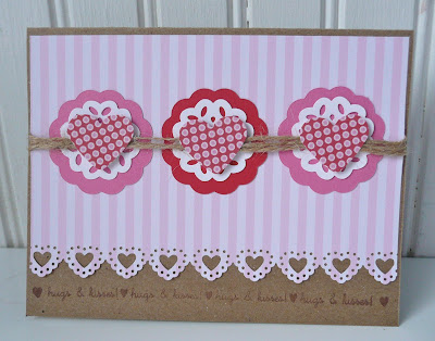
hugs & kisses


If you look at the archives, you’ll notice that I only posted three times in February, and two of those were 52Photos. Yes, I did make more than one card in February. No, I did not blog about them, but that is about to change.

Back in this post, I explained why I send out so many notes, especially for holidays. I had every intention of sending out Valentine’s cards, but needed to go to my parents unexpectedly. Before I left, I was able to make one card for Brianna and figured it was just as easy to make a second at the same time.


If this card were received around February 14, one would naturally assume it a Valentine’s card with its pink, red and hearts. If received in May without a Happy Valentine’s Day sentiment inside, I think it could pass as a thinking of you card. After talking to Brianna, the second option is probably the better one.

Brianna is usually quick to thank me for any card I send her and tell me what she likes about it. That didn’t happen with the Valentine’s card. Because some cards were “lost” in the mail last semester (That story would need its own post.), I asked Brianna if she received her card. Her response:  “Yes, I got it. That was a sad excuse for a Valentine’s Day card though. A paper bag and twine? C’mon, Mom. Where were the glitter and doilies? It’s Valentine’s Day, the perfect excuse to go over the top.”

Wonder what I’ll be doing next year? Not hardly.

nancy

supplies:
paper:  kraft c/s and Simple Valentine pp (PTI); white c/s (Staples); pink and red c/s (Recollections); Pink Thin Stripes (Frances Meyer)
stamps:  Simple Valentine (PTI)
ink:  chestnut roan chalk (Clearsnap)
dies and punches:  lace heart edge and vintage doily (Martha Stewart); heart (Marvy); scalloped circles (Spellbinders)
extras:  jute twine (Westrim Crafts)

March 23, 2011

52photos: week 7


The prompt for week 7 of 52Photos was up.


This photograph was taken during the time I spent with my parents last month. There were many moments when I focused on the squirrels' nests high up in the bare trees, trying to calm my worries and stop my thoughts from racing in a million - or so it seemed - directions.

nancy

52photos: week 6


The prompt for week 6 of 52Photos was morning.


I am not a morning person in any sense of the word, so I rely on my alarm clock to get my day started. This is what I see each morning on my nightstand when I lean over to shut off the alarm. A more accurate representation would include my hand hitting the snooze button for the tenth time.

nancy

PS – I am far behind on my 52Photos for a variety of reasons. I still plan on participating, although my photos may not be in week/assignment order.

March 18, 2011

grape or raspberry?


Make It Monday and Tuesday Trigger somehow just seem to go together, like peanut butter and jelly or mashed potatoes and gravy or a burger and fries or… Well, you get the point. Sometimes, though, I worry that I might be forcing the pairing. PB&J just isn’t the same unless the jelly is grape, and I was afraid this card was going the raspberry jelly route, good but not great.

Anyway, when I saw the TT photo, I wished I owned the PTI Button Boutique set. Since I don’t, I needed to come up with another idea that would capture the feel of the button card. That along with the colors were what stood out for me.


Love Lives Here was sitting on my table, so I used it to test colors, also trying out patterns with the square stamps, which are the bottom portion of the house stamps. The 3x4 patchwork pattern speaks to me of the buttons grid. I’m happy with how it turned out.


I used harbor blue as an accent and the buttons are a given. The top of the card panel is embossed with polka dots to complement the dots in the stamps, pick up the hardanger stitching in the napkins, and meet the requirements of MIM#6, a partial embossing challenge. 


I’m still trying to decide. Is it grape or raspberry jelly?

nancy

supplies:
paper:  vintage cream c/s (PTI)
stamps:  Love Lives Here (PTI)
ink:  creamy brown and chestnut roan chalk, dune and harbor pigment (Clearsnap)
punches:  1-inch circle (EK Success); 1/8-inch circle (Recollections)
extras:  Swiss Dots embossing folder (Cuttlebug); buttons (La Mode, Basic Grey, My Mind's Eye); lace from LSS; ribbon (Michael’s); seam binding (thisgoodday Etsy); ecru floss (DMC); quilt pin from stash; beads (Michael’s brand); Caribbean blue opals (Jolee’s)

March 17, 2011

happy saint pat’s


I thought it only appropriate that I use the latest sketch, WMSC38, from the Waltzingmouse Sketch Challenge for my St. Patrick’s Day card.


In order to use the dies I wanted, this ended up being a mini-card, about three inches in diameter. To me, this was a good result because it was drastically different from last year’s pocket card, which keeps the recipients from getting bored with my creations. To leave enough room for a note inside, I put an Irish blessing on the top half of the card and the sentiment on the bottom.


Since I don’t have my picture on my blog, you can’t tell that most people would assume that I’m Irish Catholic by looking at me. (It must be the red hair and fair skin.) Those people would be partially correct. I am Irish and Catholic, but I’m also half German from my dad’s side of the family tree. I bring this up because each year on March 17, my very German dad would walk into the kitchen with one sock off and point at his big toe with amazement. His toe would be green and he would tell us it’s his Irish blood coming out in honor of St. Patrick. Guess Dad really does have a wee bit of the blarney in him.

May the good saints protect ye, and the devil neglect ye. Happy St. Patrick’s Day.

nancy

supplies:
paper:  green c/s (Bazzill); tan c/s (Recollections); striped pp (My Mind’s Eye Laundry Line)
stamps:  shamrock from Series 29 (Studio G)
ink:  olive pastel chalk (Clearsnap)
dies:  Classic Circles (Spellbinders); Victorian Lace border (PTI)
extras:  emerald gem stickers (Martha Stewart); Irish Blessing; Stonehenge font

March 13, 2011

it's distressing


When I saw this “oh so lovely” image for Moxie Fab’s Tuesday Trigger, I knew that I wanted to use Distress crackle paint to get the aged look of the chair. And lucky me, it meant that whatever I made could be entered into Papertrey Ink’s Make It Monday #5:  Distressing Edges, too.

I had hoped to pull in the lushness of the floral bouquet, but couldn’t get it to work with my supplies on hand. After making a few sketches and looking through my inspiration folder, I came up with the idea for a card using buttons for dimension, but there was still something missing. Enter Betsy Veldman’s use of PTI’s soon-to-be-released angled label die and I knew what would finish my card, a ticket.


In the interest of full disclosure, I had pulled the elements of my card together, but had not yet assembled it, before seeing Lisa Johnson’s Flower Fusion #2 card. I was pretty pleased with myself for coming up with a similar design as one of the talented PTI design team members. Go me.


Life has been somewhat distressing this past month, which explains my lack of posts. Creativity had taken a back seat, so I was excited when ideas starting percolating upon viewing the trigger photo. Thanks, Cath.

My wish for you is that your life is not as ragged around the edges as this card.

njm

PS – My plan was to enter my sister’s birthday card into the Papertrey Paper Dolls PTI challenge, but as the deadline nears and my daughter keeps calling in frustration over a performance installation piece, my plans have changed. This card is being entered in the challenge. My P*T*I items are:
            P:  paper and paint
            T:  ticket and twine
            I:  ink and inspiration from PTI DT member Betsy

supplies:
paper:  kraft c/s (PTI)
stamps:  Just the Ticket, Round & Round (PTI); Create Spring (Hampton Art)
ink:  silk green pigment, burnt sienna chalk, creamy brown chalk (Clearsnap)
paint:  old paper Distress crackle paint (Ranger)
dies:  Just the Ticket border (PTI)
extras:  buttons (PTI and Basic Grey); jute twine (Westrim Crafts)