Last weekend, Laurie wrote about the time she used to spend in the card aisle and shared a card she made based on inspiration from a recent visit to said aisle. Many of the card makers that read Laurie’s blog related to her words. In fact, there were so many people commenting that Laurie put out a challenge to her readers to go and find some card inspiration and whip something up.
I too used to spend hours looking at cards. I would park myself at Hallmark or the now defunct Treasure Island (how I miss that store) or PAPYRUS searching for THE perfect card. So this week, while at Target, I took a detour through the card section to see if I could find a little inspiration for the challenge. Being totally honest, I have to tell you that I started out looking at not-so-fine cards so that mine would look better than the original. My eyes and hands were too well trained, though, and kept going to the PAPYRUS cards. Here’s the one that I chose for my inspiration:
You cannot tell from the photograph, but this card is wonderful in person. (I had to photograph the card through its cellophane package, and Target’s lighting is not conducive to furtive shots.) The card is white textured cardstock with a light blue border. There is a blue thread weaving its way through blue vellum flowers with blue seed pearl centers. The card has both a charm and elegance to it. If the card didn’t cost $5.95, I might have been tempted to buy it. Of course, I would have blamed Laurie for that purchase. We all know, I wouldn’t have been in that aisle in the first place if it weren’t for Laurie’s challenge.
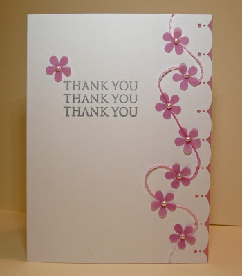
My take on the PAPYRUS card is in pink since I don’t have blue vellum. I made a few modifications, but the card is fairly close to the original. My card is sweet and I like it, but I would rather it be charming and elegant. Perhaps, I need to try it again in blue.
The beauty of this sweet little card is that it didn’t cost me $5.95. All of the materials were already in my supplies, so nothing was spent. (Does that mean it cost nothing?) And because I used a stamp set and two punches, their per use costs decreased. Ah, rationalization is a beautiful thing.
nancy
supplies:
paper: white c/s (Staples); passion fruit vellum (WorldWin)
stamps: Thank You Sayings (Hero Arts)
ink: silver pigment (Clearsnap)
punches: traditional scallop edge (Martha Stewart); flower power (EK Success)
extras: white mini pearls (Martha Stewart); floss #4180 (DMC)


11 comments:
That is fabulous! I like yours better!
What a great idea to get some inspiration that way. I never thought of it. Your card turn out very elegant and beautiful
Great card! Love how you took an idea from the store and made it your own!
Love your card with the pink, it just makes me smile, and the punched edge is darling.
Oh my! Nancy this is beautiful! I love that floss! This is a gorgeous card! I am so glad you went and spent some time in the card aisle! Thanks for playing along!
oh, wow! your card is a beautiful thing and i must say that all of your 'justifications' work for me! i really do love the placement of all of your flowers and your border punch is perfect.
Love all the rationalisations! Great card too - better than the original! Nicole x
Very pretty and a great idea thanks for sharing with us x
Nancy I LOVE your take on the card.. so PRETTY!!! Have a GREAT day!
Very pretty, Nancy! Great idea to be inspired by a commercial greeting card -- and, yes, I remember those days of spending hours searching the card racks... bet my Hallmark Gold Card is missing me... they probably think I'm deceased due to the sudden lack of activity! :)
Nancy, your card is perfect, I like it better then the store card. Beautiful!
Post a Comment