Showing posts with label PTI stamp-a-faire. Show all posts

August 31, 2017

saf2017


It’s August and I’m posting on my blog, so it must be time for Papertrey Ink’s Stamp-a-faire. For links to all of the challenges, you can make your way to Nichole’s blog. Because I’m playing beat-the-clock, I’m going to keep the chatter to a minimum.

TAKE TEN WARM-UP CHALLENGE


I take different approaches as I journal in my Bible. For this verse about comparison, 2 Corinthians 10:12, I felt that the sentiment from Choose Joy perfectly conveyed the meaning and no other words were needed. (FYI: Stamping in a Bible that is not specifically a journaling Bible has its own special set of challenges. Note the subpar stamping. And isn’t it appropriate that I feel the need to explain away my flaws when sharing a verse on not comparing yourself to others?!)

 
PAPER WITH LAURA

 
My intent for the paper scraps challenge was completely different until I saw this printable. I tried to use the vellum, but it just didn’t fit in this design.
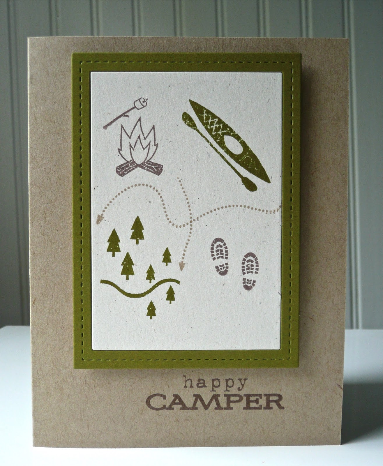
WOOD WITH NATASHA

 
The woodgrain embossing folder was inked with Vintage Cream. I first tried Classic Kraft and Fine Linen, but both were too dark. The Vintage Cream adds a lovely subtle contrast that is visible in person, just not in my picture. I need Wanda to photograph my cards for me!

BRONZE WITH KIMBERLY

 
With this challenge, I was reminded of why I do not use Perfect Pearls. The shine is gorgeous, but it is messy on the card. I started making a different card with horizontal stripes under the sentiment, but the Perfect Pearls stuck to the cardstock along with the adhesive. After trying a few different ways to clean up the stripes, I had the brilliant idea (eye roll) of adding the Perfect Pearls to embossing paste. Because the shimmer was missing from the mixture, I added some of the Perfect Pearls over the paste while the stencil was still in place. The resultant grainy texture with just the very slightest of shimmers is fabulous for a masculine card. Score!

BRONZE WITH JESSICA

 
Like Jessica, I had to mix some bronze embossing powder. I used copper, gold and a little bit of bronze Perfect Pearls since that container was sitting right in front of me just daring me to do it. The bottom layer of the butterfly wings is edged in the custom embossing powder, too.

TIN WITH CARISSA

 
I do not have silver gilding flakes, so I used gold. It is hard to tell from the photo (Help, Wanda!), but the dots in the centers of the flowers along with a few around the arrangement have an amazing shine. I think this might be my favorite card from SAF.

I hope you had fun making your Stamp-a-faire creations.

nancy

July 26, 2016

saf2016: watercolor like a master

This card is based on the poem "Jack Frost" by Helen Bayley Davis. And the photos neither do the watercolor technique or the card justice. Please do come back when I post better pictures to get a more complete story.


Jack Frost

Someone painted pictures on my
Window pane last night –
Willow trees with trailing boughs
And flowers – frosty white
And lovely crystal butterflies;
But when the morning sun
Touched them with its golden beams,
They vanished one by one!

~ Helen Bayley Davis


saf2016: gilded in gold

One of the small frames in The Pier collection by Crate Paper was gilded for this challenge. I'll take better pictures and share more about the card tomorrow. I just want to get this posted for now. Why am I always playing beat the clock?


saf2016: master color recipes

I'm posting very late, so I'll come back and add some background information along with products used.


July 24, 2016

saf2016: share your masterpiece


If I’m posting on my blog, it must be time for either Papertrey Ink’s anniversary celebration or Stamp-a-faire.  Since the weather is disgustingly hot and humid, it could only be Stamp-a-faire, a wonderful free online stamping event. To open the festivities, Nichole asked us to share THE PROJECT that we are most proud of, our masterpiece.

I looked through my photo file, remembered different projects, and thought about the why behind those projects I was considering. Should I pick that card because it was the prettiest? or that one because it was made to encourage my daughter as she worked on her last college film? or my first gratitude journal because of memories of blessings that it holds inside? or the “I Believe” mini-album that each of the girls in my Sunday School made because of the faith captured? After much deliberation, I decided to share a simple card. It is not in any way a masterpiece nor is it close to my usual style… unless I’m making a card for a guy.


Why this card? To understand, you’d have to know the way I approach card making. Usually when I make a card, I start with someone else’s card that I use as inspiration. I definitely try to make it my own, but it is rare that I look at a stamp or die and an idea for a card immediately comes to mind. That doesn’t bother me because I consider myself a crafter rather than an artist and I approach this hobby the way I would cross stitching or crocheting – with a starting pattern. To me, the inspirational card is similar to a stitching pattern, which I make my own with color, patterned paper and/or the actual stamps I own.

This card is my exception. When I saw the stamp set in Studio Calico’s Blue Note card kit, released in December 2013, I immediately knew that I wanted to use the stripes and stars stamps for a Fourth of July card. I even pictured it in my head! When I sat down to make my cards in June of the next year, I was so excited with how it turned out. The card was super simple, but with the layers of color that I love. To me it was perfect for an Independence Day card, but the best part was that it was all me from start to finish. And that is why this card is my masterpiece.

 
When I stopped by the PTI forum, there were a number of people whose plans for playing along were disrupted. Unfortunately, I’ve fallen into that group. My daughter has pneumonia so I’ve been playing nursemaid this past week, but still had hopes to sneak in a card. Last night, though, I got sick and spent the night curled in a ball with stomach pain. I’ve straightened out enough to be able to type this very wordy post and am determined to make a card on Monday. Such is life.

I hope you are enjoying your Stamp-a-faire experience.

nancy

PS - My daughter has joined the human race once again. The medicines and rest are working.

supplies:
stamps:  Let Freedom Ring (PTI); Blue Note card kit (Studio Calico)
ink:  pure poppy and enchanted evening (PTI)
paper:  white, pure poppy and enchanted evening card stock (PTI)
dies:  Super Star border (PTI)

September 1, 2015

stamp-a-faire 2015 (part 2)


Here are two more cards for Papertrey Ink’s Stamp-a-faire, posting here strictly for entering the challenges. The remainder of my cards can be seen in part 1 of my SAF post.


This second card for the mix and match challenge is based on Dawn’s tutorial on mixing color. I started with a color that I don’t use often, orange zest, and paired it with some richer autumnal colors. I love how the card turned out, placing it in my top two along with the make it work card.


To me, those hexagons are colorful leaves, either still in the tree or blowing through the air. I haven’t quite decided on that yet. When you open the card, the leaves are in a pile on the ground. Do you think the recipient will see this card the same way?


As mentioned in SAF part 1, the blue version of the card for this challenge charmed me, so I decided to make another in shades of pink. I prefer the blue version, but the embossing on the pink card looks more like stitching. That might have something to do with me re-inking my VersaMark pad.


Again, thank you Papertrey for this incredible event.

nancy

stamp-a-faire 2015 (part 1)


If you’re reading this post, you probably know about Papertrey Ink’s Stamp-a-faire with its theme based on Project Runway, one of my favorite shows. I actually watch it live. Let’s jump right into my projects.


I tried to make something for the bridal challenge, but just wasn’t happy with how it was turning out. I need color! So I moved onto the patterns challenge and worked with Laurie’s sketch.


I try to send a card to my father-in-law every week or two. When I sit down to write, I usually draw a blank, so I've started keeping a list of things that happen to write about. I used that list to figure out themes for my cards, which leads us to the camping card. The card is much simpler than my usual. I added some enamel dots, then removed them, deciding to keep this card a little more masculine for Scotty.


The inside of the card with the trail of footprints from Summer Camp is actually my favorite part of this card.


My daughter and I canned peaches last week, so this next card uses Friendship Jar. I took on Danielle’s challenge of using twine and wrapped some around the jar to attach a tag. This card is really sweet and too feminine for Scotty, so I might save it for someone else and make one using graphic patterns for him. Then, again, he was married for more than 50 years to Patsy, who loved pastels and florals, so he might like something a little girly in her memory.


I made two cards for the mix and match challenge, one for Betsy’s tutorial of mixing patterns and one for Dawn’s on mixing color, which will be in the SAF post part 2. My card is based on this cheerful card. What I am most pleased about with my pattern mixing is that I used papers from different collections.


After watching Melissa’s video on using stick pins, I had a plan for my card until I saw Heather’s blue stamped and stitched card. I don’t often use blue, but I wanted to try a card in that color scheme, so I CASEd Heather’s card as much as I could without having the patterned papers or stamp set that she used. This card so charmed me – not quite as much as Heather’s – that I decided to make another in shades of pink (posted in SAF part 2). I still plan on making the stick pin card for my sister’s birthday later this month.


Next up is the runway inspired challenge and if you haven’t taken the time to look at the video of Sean Kelly’s rainway dress, please do so. He took creativity and innovation to a new level with the dress he designed.

The design team pulled so many wonderfully inspiring dresses for this challenge. My initial choice was Dawn’s look and using Garden Grace, but nixed that due to timing. My second choice was Lexi’s Venice-inspired look.


The black-striped paper is an obvious nod to the striped top. I didn’t want to use a solid block of color on the bottom of the card, so the berry sorbet grid picks up the color without the visual weight of the pants. And the floral cape is captured with the Beautiful Brushstrokes flowers. I placed them horizontally, at a slight angle, rather than vertically because I was thinking of how the outfit looked when the model first posed on the runway.


For the make it work challenge, I pulled the papers used in my failed bridal challenge from the recycling bin. As I mentioned earlier, I need color, so I added some to the card design, which made all the difference for me. Oh, that little felt heart is left over from the threads challenge. I’m really happy with this card. It’s definitely in my top two from this SAF.


Since I was in my pj’s when I shot this photograph, there was no way that I was going to be in it. Instead, here are the cards that I’ve made thus far for Stamp-a-faire 2015. I still have ideas swimming around in my head from all of the inspiration, so I’ll be making more cards over the next few weeks.


Thank you to all at Papertrey who make Stamp-a-faire such a fun and inspiring event.

nancy