February 15, 2016

pti ninth anniversary


Because I am playing beat the clock, just pictures of the cards will be shared for now. During the week, I’ll try to return with some information about each card. Please know that if I’ve shared two cards for a challenge, I’ve only entered one. It just means that I was having fun with a challenge and kept creating. Also, as I mentioned in my Create Along with Us post, it has been five months since I’ve made a card. Because I’m out of practice, I’ve CASE’d a few of my cards, trying to make them with the supplies I own.


Grab & Craft:  I used every second of the five minutes for grabbing supplies. They included watercolor paper, cardstock, watercolors, Fancy Flakes dies, Two Feet Deep and Winter Hills stamps, and ink.


Color Pop Fortune Teller:  Summer Sunrise, Berry Sorbet and Royal Velvet


Paper Crafting Alphabet:  new product, border, at least five colors, and incorporate yellow


My computer is old in technology years and leads to some challenges because of no longer being able to update its browser. One of those challenges is not being able to comment on some blogspot blogs; it is dependent on how the comments are set up. Please accept my apologies if yours is one of the blogs. I was that person who commented on every blog for each challenge or blog hop in which I was a participant, so this really bothers me. Thank you for visiting.

nancy

pti create along with us


I last made a card in September, five months ago. When I was at my computer, looking at wonderful, lovely, colorful cards, I wanted to make something, but by the time I got to my supplies, the desire to create would disappear. Papertrey Ink’s anniversary challenges flipped the switch for me and I’ve made 13 cards since Thursday. I’m a very slow card maker, so that productivity is close to miraculous. My anniversary challenge cards are in the next post. My PTI Create Along With Us challenge card follows.


My inspiration is Betsy’s wonderful, merciful Savior card. Since I kept going back to Betsy’s blog to stare at that card, I thought it would be the perfect choice for this challenge. Basically, I copied Betsy’s card as best as I was able using Beautiful Brushstrokes, One Liners: Happy and my novice watercoloring skills.


Thank you for stopping by during this very busy time.

nancy

September 1, 2015

stamp-a-faire 2015 (part 2)


Here are two more cards for Papertrey Ink’s Stamp-a-faire, posting here strictly for entering the challenges. The remainder of my cards can be seen in part 1 of my SAF post.


This second card for the mix and match challenge is based on Dawn’s tutorial on mixing color. I started with a color that I don’t use often, orange zest, and paired it with some richer autumnal colors. I love how the card turned out, placing it in my top two along with the make it work card.


To me, those hexagons are colorful leaves, either still in the tree or blowing through the air. I haven’t quite decided on that yet. When you open the card, the leaves are in a pile on the ground. Do you think the recipient will see this card the same way?


As mentioned in SAF part 1, the blue version of the card for this challenge charmed me, so I decided to make another in shades of pink. I prefer the blue version, but the embossing on the pink card looks more like stitching. That might have something to do with me re-inking my VersaMark pad.


Again, thank you Papertrey for this incredible event.

nancy

stamp-a-faire 2015 (part 1)


If you’re reading this post, you probably know about Papertrey Ink’s Stamp-a-faire with its theme based on Project Runway, one of my favorite shows. I actually watch it live. Let’s jump right into my projects.


I tried to make something for the bridal challenge, but just wasn’t happy with how it was turning out. I need color! So I moved onto the patterns challenge and worked with Laurie’s sketch.


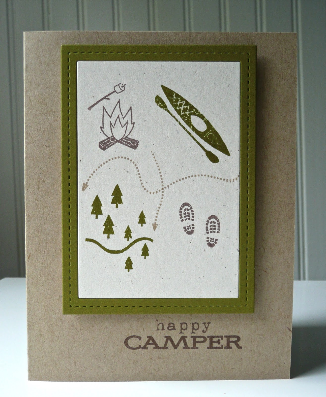
I try to send a card to my father-in-law every week or two. When I sit down to write, I usually draw a blank, so I've started keeping a list of things that happen to write about. I used that list to figure out themes for my cards, which leads us to the camping card. The card is much simpler than my usual. I added some enamel dots, then removed them, deciding to keep this card a little more masculine for Scotty.


The inside of the card with the trail of footprints from Summer Camp is actually my favorite part of this card.


My daughter and I canned peaches last week, so this next card uses Friendship Jar. I took on Danielle’s challenge of using twine and wrapped some around the jar to attach a tag. This card is really sweet and too feminine for Scotty, so I might save it for someone else and make one using graphic patterns for him. Then, again, he was married for more than 50 years to Patsy, who loved pastels and florals, so he might like something a little girly in her memory.


I made two cards for the mix and match challenge, one for Betsy’s tutorial of mixing patterns and one for Dawn’s on mixing color, which will be in the SAF post part 2. My card is based on this cheerful card. What I am most pleased about with my pattern mixing is that I used papers from different collections.


After watching Melissa’s video on using stick pins, I had a plan for my card until I saw Heather’s blue stamped and stitched card. I don’t often use blue, but I wanted to try a card in that color scheme, so I CASEd Heather’s card as much as I could without having the patterned papers or stamp set that she used. This card so charmed me – not quite as much as Heather’s – that I decided to make another in shades of pink (posted in SAF part 2). I still plan on making the stick pin card for my sister’s birthday later this month.


Next up is the runway inspired challenge and if you haven’t taken the time to look at the video of Sean Kelly’s rainway dress, please do so. He took creativity and innovation to a new level with the dress he designed.

The design team pulled so many wonderfully inspiring dresses for this challenge. My initial choice was Dawn’s look and using Garden Grace, but nixed that due to timing. My second choice was Lexi’s Venice-inspired look.


The black-striped paper is an obvious nod to the striped top. I didn’t want to use a solid block of color on the bottom of the card, so the berry sorbet grid picks up the color without the visual weight of the pants. And the floral cape is captured with the Beautiful Brushstrokes flowers. I placed them horizontally, at a slight angle, rather than vertically because I was thinking of how the outfit looked when the model first posed on the runway.


For the make it work challenge, I pulled the papers used in my failed bridal challenge from the recycling bin. As I mentioned earlier, I need color, so I added some to the card design, which made all the difference for me. Oh, that little felt heart is left over from the threads challenge. I’m really happy with this card. It’s definitely in my top two from this SAF.


Since I was in my pj’s when I shot this photograph, there was no way that I was going to be in it. Instead, here are the cards that I’ve made thus far for Stamp-a-faire 2015. I still have ideas swimming around in my head from all of the inspiration, so I’ll be making more cards over the next few weeks.


Thank you to all at Papertrey who make Stamp-a-faire such a fun and inspiring event.

nancy

July 20, 2015

create along with us


When Papertrey Ink announced its new Create Along With Us challenge, I thought the most difficult part would be choosing the one card to use as inspiration. Actually, that was easy because Melissa's “Hello Dearest Friend” card just spoke to my heart.


The most difficult part of the challenge was getting my card posted on my blog. For some reason, there seems to be a major disconnect for me between completing and entering a challenge. But, this is the inaugural Create Along With Us challenge, so I just had to take part.


This card is going to my father-in-law, who used to garden when he had a large yard. (And yes, the inspiration for the radish colors also came from Melissa.) I felt that I was already pushing feminine boundaries with the pink gingham, so I didn’t add the bow. My plan was to cover the tag hole with some other embellishment, but it looked off, which resulted in the one thing that I wish I could have changed – using a Half and Half die instead of Tag Sale #6. If I hadn’t already attached the card front, I would have made the switch.


Whenever I use one of Melissa’s creations as my inspiration, I never expect my card to look anywhere near the same as hers. She is an artist; I am a crafter. Nevertheless, there are certain cards that sometime capture the essence of the original design. This is one of those cards. Since I have no photography skills, you’ll just have to take my word that this card leaves me enveloped in the warmth, caring and happiness that Melissa’s card did. I hope those same feelings make it through the mail and reach my father-in-law.


Thank you for stopping by.

nancy

supplies:
stamps:  Vegetable Garden; Happy Hexagons; Polka Dot Basics; and Two Feet Deep (PTI)
ink:  pure poppy, sweet blush, aqua mist and simply chartreuse (PTI); angel pink (Memento); VersaMark
paper:  rustic white and simply chartreuse card stock (PTI); vellum (Paper Studio); Family Ties (Pebbles); Country Drive (Echo Park); Lost & Found Two (MME)
dies:  Tag Sale #6; Pinking Shears border; Cover Plate: Hexagons; and Vegetable Garden (PTI); summer (Studio Calico)
extras:  leaf, powder, blush and rouge Zing! embossing powder (American Crafts); Lost & Found Christmas enamel dots (MME); swimming pool enamel dots (doodlebug design)

March 9, 2015

mim#203: doodling over stamps


My approach for Papertrey’s Make It Monday #203, doodling over stamps, was a little bit different than Ashley’s. Rather than stamp the actual line image, I used the back of the stamps to get a group of rectangles.

 
After watching the MIM video, I saw a wonderful image on Home Depot’s Instagram that inspired my card.


So I used Ashley’s doodling technique to create a group of frames by stamping the backs of the stamps, softening some of the edges with water, and then doodling loose rectangles to make frames.


The paintbrushes in the inspiration photo were replaced with a wood veneer deer, the recipient’s spirit animal. This is a birthday card for my daughter’s friend, so there were some “suggestions” given, e.g. the deer, for its design.


The soft, muted colors of the card were difficult for me to photograph, but are lovely in person. The card was rushed to the mailbox or else I would have tried for a shot under better lighting conditions. I like the card so much more in person than in my photographs.


Thank you for stopping by.

nancy

supplies:
stamps:  Keep It Simple: Belated Birthday; Framed Out #12; Love Lives Here; Tiny Tags; Grunge Me; Gobble, Gobble; No Strings Attached; Birthday Bash Sentiments; Background Basics: Inspiration; and Stylish Sentiments: Birthday (PTI)
ink:  clean slate (Studio Calico); teal zeal and elderberry (Memento); violet pigment (ColorBox)
paper:  soft stone card stock (PTI); watercolor paper (Strathmore)
extras:  wood veneer deer (Studio Calico Penny Arcade kit); neutral Color Theory enamel dots (Studio Calico)

February 24, 2015

with <3


This was going to be a quick post Sunday evening to get my card in for Papertrey’s 201st Make It Monday, using a cover plate die cut as a stencil. The post never went up because I used "<3" in the title and it is an HTML code and caused a break in the link. Who knew. Anyway, back to the more interesting part of the post. I used a portion of Cover Plate: Hearts and added glitter over the light molding paste. For some reason the glitter wouldn’t stay stuck, so I went over it with Glossy Accents and additional glitter.

 
My first idea, which didn’t work out, used clear glitter over the light molding paste. Almost a week later, the glitter is not coming off. I’m not sure what happened with the colored glitter, one of the great mysteries of life, like using <3 in a blog title.


Winter is still making itself known. Hope you’re warm where you are.

nancy

supplies:
stamps:  Monthly Moments: February (PTI)
ink:  tuxedo black (Memento)
dies:  Cover Plate: Hearts and Tiny Tags (PTI)
paper:  white, pure poppy and raspberry fizz card stock (PTI)
extras:  washi tape (stash, mainly from Michael’s); blossom twine (The Twinery); light molding paste (Golden); garnet and tourmaline fine glitter (MSC); light pink glitter (Doodlebug)